CCH KPI Monitoring: Generating and Delivering Charts

Generating & Delivering Charts
KPI Monitoring includes an embedded chart & graph design module that adds visual detail to an alert. Like Reports, charts can be scheduled, generated, and delivered (such as a “Daily Open Tickets” chart) or they can be associated with events (such as an event that checks to see if any support reps have more than 10 tickets assigned to them and – if so – generates and deliver a “Rep Ticket Load” chart.
Charts, Events, & Queries
It is very important to understand that a chart uses a query to generate its content. Do not confuse a chart’s query with an event’s query – charts and events rarely (if ever) use the same query, and it is not recommended that they do so.
As such, it is suggested that any queries that you design for use with charts be given a unique naming convention, such as starting the query name with “Chart;
. . . “ as in “Chart; Calls Per Rep”.
How Charts Are Generated
Charts have their content driven off of the results of a query; for example, a chart that shows “current month total sales by salesrep” would use a query that totals sales by salesrep and then has a filter to retrieve only those orders that have been placed during the current month. Likewise, a chart that shows how many support calls are currently assigned to each support rep would use a query to count the number of open tickets per rep and would use a filter to retrieve only those tickets that were currently open.
Charts usually use aggregate queries (queries that either sum a numeric field or count the number of records meeting certain criteria), but charts can use non-aggregate queries as well (such as a query that shows all currently backordered line items and their backorder total).
Chart Query Design: Two Requirements
Regardless of whether a chart is using an aggregate query or a not, a chart’s query should always retrieve just two columns – and in a specific order:
- Column #1: The chart’s horizontal (or ‘x’) axis; the “item being counted”, such as “customers” (whose sales are being totaled) or “support tickets” (which are being counted per support rep).
- Column #2: The chart’s vertical (or ‘y’) axis; the numeric representation. This is the query column performing the aggregate function, such as “summing” sales totals, or “counting” the number of support tickets.
How Charts & Graphs Are Delivered
Charts and graphs can be delivered in the following manners:
- Attached to an email (you can attach multiple charts to a single email)
- Embedded within the body of an email (only one chart may be embedded within a single email message)
- Posted to a webcast page
- FTP/SFTP to a destination folder
Chart Design: The Role of “Parameters”
A chart can use “parameters” in the same way a report does. Consider, for example, an event that generates a sales report -- one report per salesrep, detailing their monthly sales. The report would have a parameter on the salesrep ID.
An event that generates this report would use a “salesrep listing” query to retrieve a list of salesreps. Each of those salesreps would be passed one-at-a-time into the report’s parameter and so generate one report per salesrep.
Charts work in a similar manner.
You’d begin by creating the chart; it would use its own query and would have a parameter (filter) on the salesrep ID. The filter’s “compare value” would be the question mark (‘?’) .
An event that generates this chart would use the same “salesrep listing” query to retrieve a list of salesreps. Each of those salesreps would be passed one-at-a-time into the chart’s parameter and so generate one chart per salesrep.
A chart’s parameters (filters and/or subfilter) appear when you select the chart for an event. Because an event has its own query, you can select data fields from the event’s query to be passed into the chart’s parameters. And so, when an event with a parameter-driven chart runs, it will:
- Use the event’s query to retrieve the first matching record.
- Pass a value from that record to the parameter of the chart associated with the event.
- Generate the first chart and deliver it.
- Repeat steps 1 – 3 for each ensuing record retrieved by the event’s query.
Charts: Scheduled & Triggered
Charts can be scheduled (such as a “daily sales chart”), or charts can be triggered (such as a “tickets per rep” chart if any rep has more than 10 tickets assigned to them).
- A scheduled chart event has no query associated with it.
- A triggered chart event is an event that uses a query to determine if certain conditions are met; if so, the associated chart is generated. Triggered charts will be generated once for each record that meets the event query’s criteria.
A Chart’s Query
Let’s consider the following chart:
This month’s sales per salesrep
- This chart will total the current month’s sales per salesrep; this chart (as with most) will make use of an aggregate query.
- The query for this chart will retrieve sales numbers and salesperson details. The chart will have two columns (the “salesrep’s name” and the “sales amount”. To “total” the amount for each salesrep, the “amount” field will have its column type changed from “Normal” to “Summarize”.
- The query will have a filter to retrieve only those sales that were placed during the current month. This filter could be parameter-driven (question marks in the “Compare Value” field) and other filters could be added.
Note: Based on the chart “type” (column or pie), you may want the data to appear in the chart in a specific order, such as showing the greatest amount at either the top or bottom of the chart. To accomplish this, you will need to specify the “Sorting” order for the chart’s query.
Create the Query
The first step in creating a chart is to create the query that powers the chart. As stated previously, a chart’s query should have only two (2) columns:
- Column #1: The chart’s horizontal (or ‘x’) axis; the “item being counted”, such as “customers” (whose sales are being totaled) or “support tickets” (which are being counted per support rep).
- Column #2: The chart’s vertical (or ‘y’) axis; the numeric representation. This is the query column performing the aggregate function, such as “summing” sales totals, or “counting” the number of support tickets.
For example:
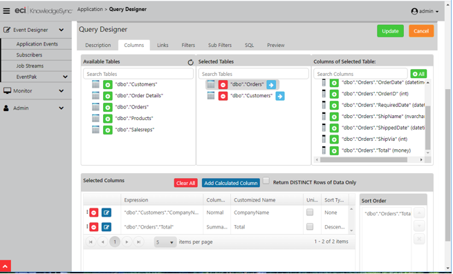
CHART QUERY DESIGN
And the typical results of a chart’s query will look like the following:
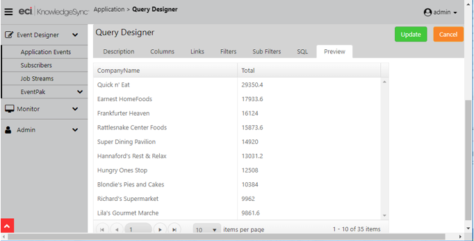
CHART QUERY OUTPUT
Once you have designed and reviewed a chart’s query, you can proceed with the configuration of the chart itself.
Chart Design: Create the Chart
Open the Event Designer, expand the application you wish to create a chart for, single-click on the “Charts” sub-branch and then click on the “New Chart” button. The following window will appear:
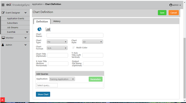
CHART DESIGN WINDOW
Make your selections based on the options detailed in the following section.
Chart Design: Formatting Options
Select from the following options:
Chart Name: Give the chart a name that describes its contents, such as “Sales; Current Month Per Rep”.
Chart Type: Choose from two formats; “pie” or “column” (bar).
Chart Style: The “style” options for a chart will vary based on the “type” of chart selected. For example, bar charts can be configured so that its bars appear “flat” or in “3D”; pie charts have additional style options.
Chart Format: (Not currently enabled)
Multi-Color: Check ON for multi-color display.
Chart Title: This is the title that will appear across the top of the chart. You may leave this field blank.
Y-Axis Title: This is the title that will appear along the left (vertical) side of the chart. Typically, this would have a title such as “Total Sales This Month”. You may leave this field blank.
X-Axis Title: This is the title that will appear across the bottom of the chart. Typically, this would have a title such as “Salesperson Name”. You may leave this field blank.
Output Filename: This is the name that the chart file (once generated) will be saved to. Note that all generated charts will (by default) be saved to the KPI Monitoring “attachments” folder; once in that folder, KPI Monitoring can move (or “copy”) the chart file to any destination location.
When choosing an output filename, you may hard-code the name or you may use any of the variable values (date variables & query variables). Do not specify an output filename extension, such as “jpeg” or “bmp”, as KPI Monitoring will automatically append that extension based upon the selected output format of the chart.
Query Selection
Under the “Add Queries” heading, select the KPI Monitoring application that contains the query that will be used to drive the chart’s contents. Once you select the application, you can proceed with selecting the specific query that will populate the chart’s contents.
You have direct access to edit the selected query (click on the blue pencil icon) as well as remove a selected query from a chart (click on the red minus sign).
Query Parameters
If the chart’s query includes “parameters” (filters or sub-filters where the “compare value” is a question mark), the green “Parameters” button will be enabled; if the query has no parameters, this button will be greyed-out.
Consider a chart called “Sales Per State by Salesrep”. The query that powers this chart would, for a selected state, show the sales per salesrep. This query would have a filter on “state” and the answer (compare value) for the selected “state” can be specified in one of 4 places:
- You can hard-code the answer in the chart’s query. When you configure the chart’s query and create the filter on the “state” field, you could type in answer, such as “WA” for the state of Washington.
- You can hard-code the answer in the chart. When you select a chart’s query and that query includes a filter where the compare value is a question mark, you will be prompted to supply an answer to that parameter. In the above example, you would click on the chart’s “Parameters” button and type in “WA” as the selected state.
- You can hard-code the answer when the chart is selected for use in an event. By leaving the ‘?’ as the answer to a parameter in the chart designer, you will be prompted to specify the parameter’s answer when you select the chart as part of an event. In this case, you could select “WA” as the chart’s parameter answer for when the chart’s event is run.
- You can have an event’s query pass its values into a chart’s parameters. Let’s say that you want to generate this chart only for states that have recorded more than $10,000 in sales. Your event would use a query to retrieve a list of those states – and then that event would pass those “state values” to your chart, one-at-a-time.
In such a scenario, instead of hard-coding the state value, you would select the chart for this event, click in the “Answer” field to the chart’s “state” parameter, and select the query data field that contains the matching state names – this query data field typically looking like this: {state}. (This way, if there were 5 states that met this event’s criteria, the event would auto-generate 5 charts; one for each state.)
A chart’s parameter entry window looks like the following:
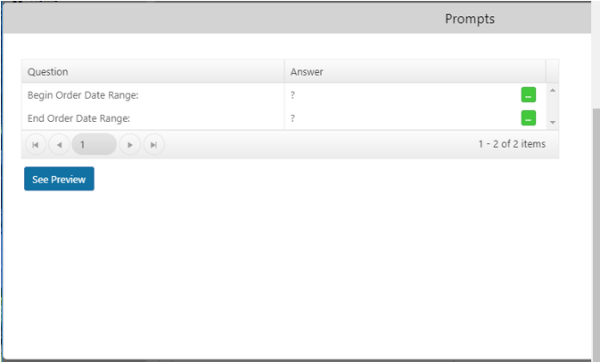
CHART PARAMETER ENTRY
Answer any query parameters and remember that you can leave parameter answers with the ‘?’ symbol to indicate that you will supply a value when the chart is configured within an event.
A Completed Chart (“Show Chart”)
When you are ready to test or preview your chart based on the configuration selections you have made, click on the button called Show Chart”. A window like the following will appear (using your selected chart type, style, and content):
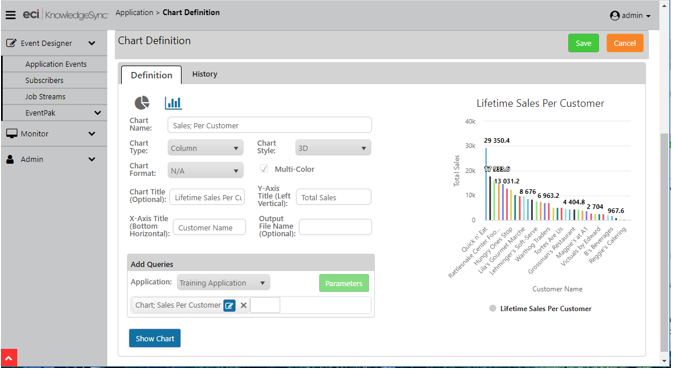
“SHOW CHART” OPTION
While viewing the chart, you may move your cursor to different elements of the chart to get additional details. Click on the “Save” or “Update” button to save your work.
Link a Chart to an Event
Once you have created and previewed your chart, you may add it to an event. Follow these steps:
Select the option to create a new event.
Select a trigger (e.g., a query, script, or web API) for the event (if the event is monitoring for specific conditions). If the event’s purpose is to generate a chart on a recurring basis, do not select any triggers. If the query has any parameters (selection criteria), fill them in as needed.
Click on the “Plus” sign in the “Deliverables” section of an event and select “Chart” as alert content. Select the application in which the chart resides, select the specific chart to associate with the event, and click on the “Add Chart” button.
Select the Chart’s Output Format
Select (single-click on) the event’s chart deliverable and then (on the right-side of your window) choose from the following chart types (formats):
- PNG
- JPG
- SVG
Supply Chart Parameter Answers
If the selected chart has any parameters, you’ll see a window like the following:
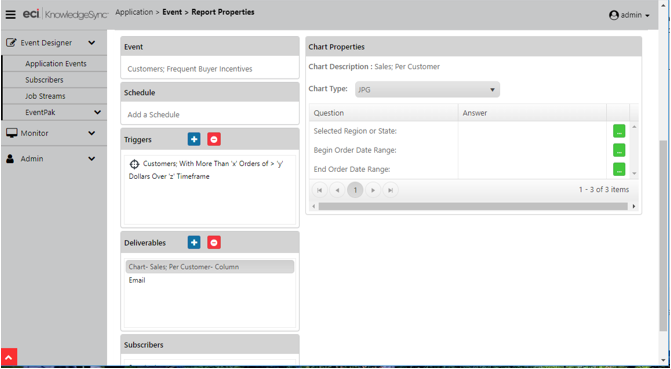
AN EVENT’S CHART’S PARAMETERS
Parameters may be “answered” using any combination of hard-coded values, date substitution variables, and values from the event’s triggers (e.g., query data fields).
Chart Delivery
Charts may be delivered to recipients as email attachments, embedded within an email (select output style “png”), via FTP/SFTP, and via web dashboard (webcasts) – in which the charts show up as URL links. Please note that all references to “reports” within an event’s tabs apply equally to an event’s charts.
Once you have selected how the chart is to be delivered, you may proceed with selecting the event’s subscribers (alert recipients) and select the schedule that controls how often the event will be executed.
When a chart is generated, the chart’s file is automatically generated in the KPI Monitoring “attachments” folder. Once there you may use a subsequent event (optionally in a job stream) to move the chart file to a destination folder of your choice.
Date-Sensitive Charts
One of the most powerful uses of charts is to display “performance over time” graphs. For example:
Sales this month versus last
Number of support calls logged daily this week
Scheduled phone calls per hour
For charts such as these, the corresponding queries are typically going to use a column that either “sums” a value (such as the amount of a sale) or a column that “counts” the number of records (such as the number of support calls) over a specific time range and – most importantly – “broken” by a specific date or time segment, such as yearly, monthly, daily, or hourly.
There is a very handy SQL command that lets you retrieve only the “year” or “month”, or “day” (number; from 1 - 31) from a date field in a database. These functions look like this:
day(sysdba.ACCOUNT.CREATEDATE)
month(sysdba.ACCOUNT.CREATEDATE)
year(sysdba.ACCOUNT.CREATEDATE)
In addition to the above commands, the below SQL command enables you to retrieve the “day number of week”;
from ‘1’ (Sunday) to ‘7’ (Saturday):
datepart(weekday,sysdba.ACCOUNT.CREATEDATE)
Whereas the following SQL command will show you the “name” of the day of the week:
datename(weekday,sysdba.ACCOUNT.CREATEDATE)
You can combine (concatenate) the preceding two commands together so that you can have both the day number and the day name in a single field in your query:
convert(char(1),datepart(weekday,sysdba.TICKET.CREATEDATE)) + '-' +datename(weekday,sysdba.TICKET.CREATEDATE)
(The “convert” function is also used in the above command because the “combined” field has to be an alphanumeric field in order to contain both the day number and day name.)
Here is the SQL command for retrieving the “hour” from a date/time field:
datepart(hour,sysdba.ACCOUNT.CREATEDATE)
The above command will show the hour in 24-hour (military) time.
All the preceding commands are for use when monitoring a Microsoft SQL Server database; if monitoring a database other than SQL Server, please refer to your database documentation on the use of date-related “scalar functions”.